# Checkboxes
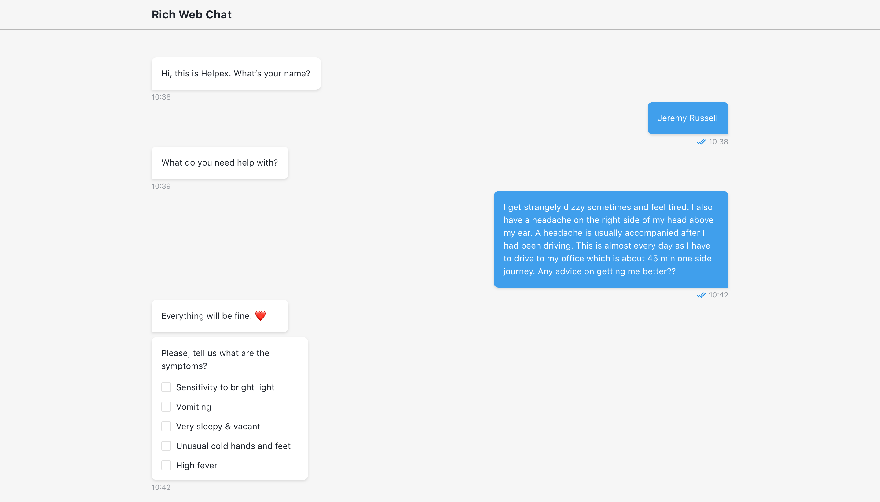
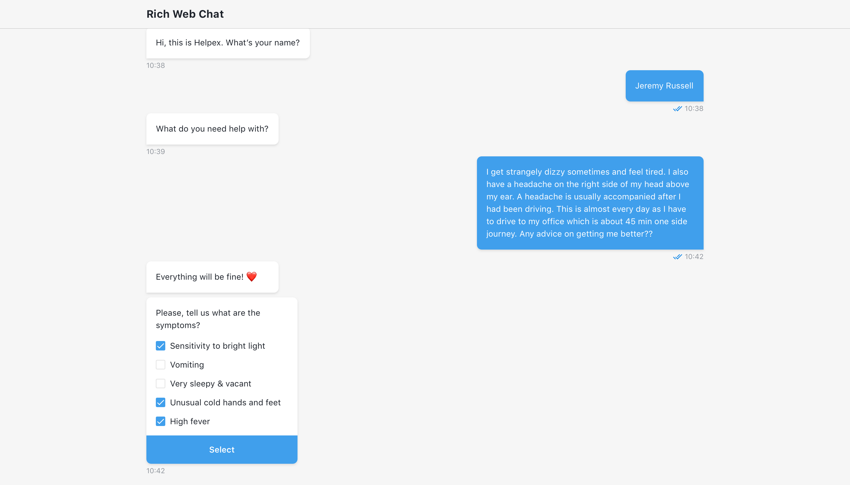
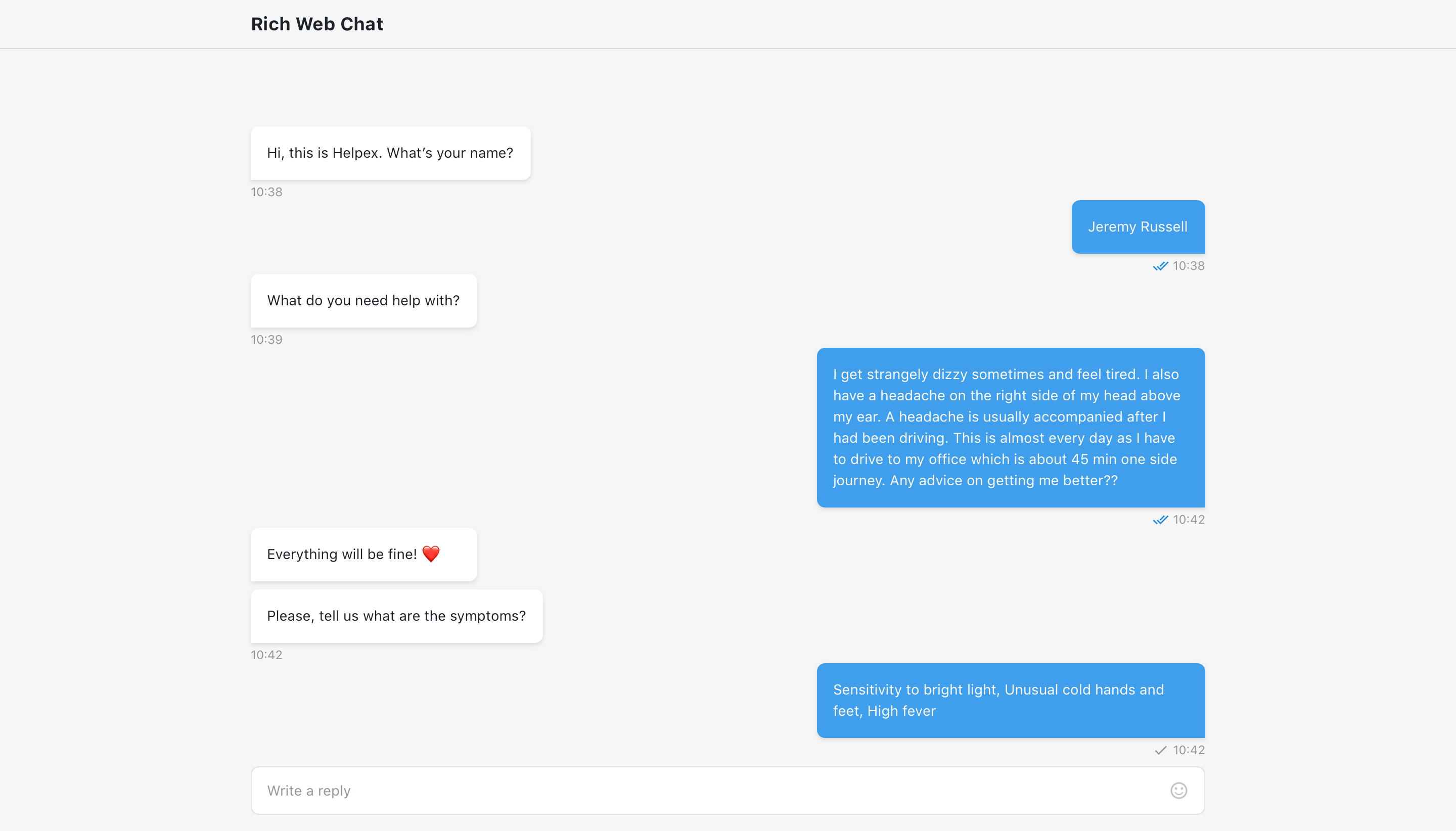
The step will wait for visitor to select one or multiple options from the checkbox group and submit it. Option, selected by visitor, will be returned in user reply as a coma-separated row.
Multiple checkboxes can be added via '+ Add checkbox' button.
The checkbox label input is required and will not be truncated. The checkbox value input must be unique for each checkbox within the step.
Option to preselect one or multiple checkboxes is also available.


# Code mode
In code mode checkbox group can be defined as array of objects:
[
  {
    label: 'checkbox option 1',
    value: 'checkbox value 1',
  },
  {
    label: 'checkbox option 2',
    value: 'checkbox value 2',
  }
]
TIP
Note in order to checkbox to be valid, it should containt both label and value props.
# Output
Chosen by the user checkboxes are included in the output.
The structure of the output is:
{
  checkbox: [
    {
        label: '',
        value: ''
    }
  ],
  checkboxText: '' // concatinated string of selected checkbox labels, (example: Checkbox 1, Checkbox2, Checkbox 3)
}
# Use function to define user answer
Allows to override default answer by custom message.
# Available variables
The same as output example.
{
  checkbox: [
    {
        label: '',
        value: ''
    }
  ],
  checkboxText: ''
}
# Example
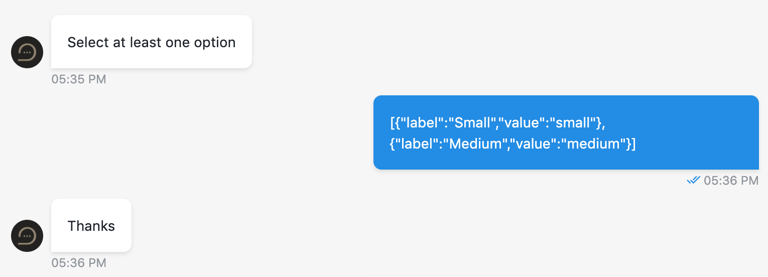
return JSON.stringify(checkbox);
# Step configuration:

# Result:
Two options were selected.

← Cards Credit card →