# Cards
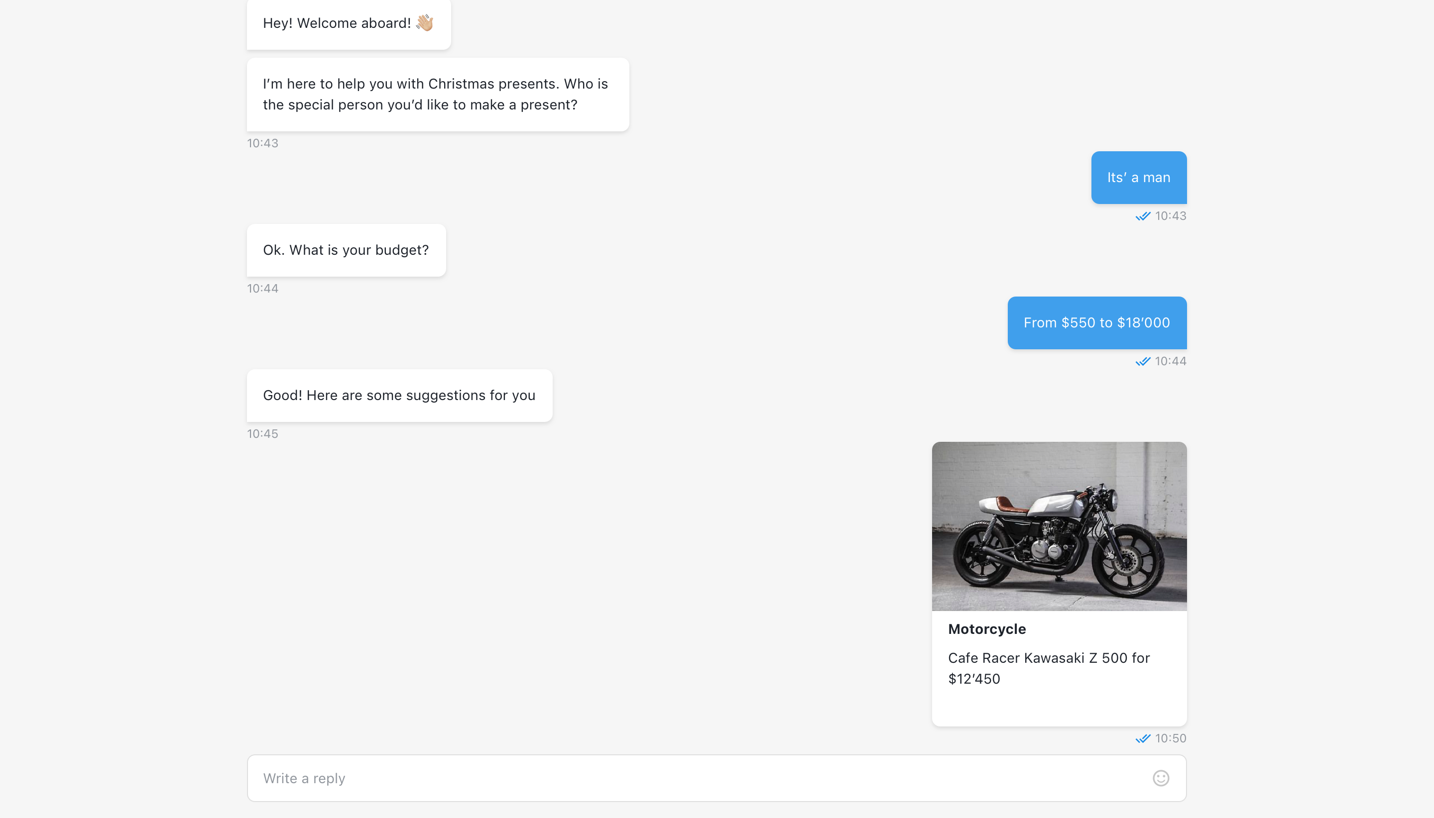
The step will wait for visitor to pick one or multiple of the cards from the carousel. Option, selected by visitor, will be returned as a user reply and viewed as a card without submit button.
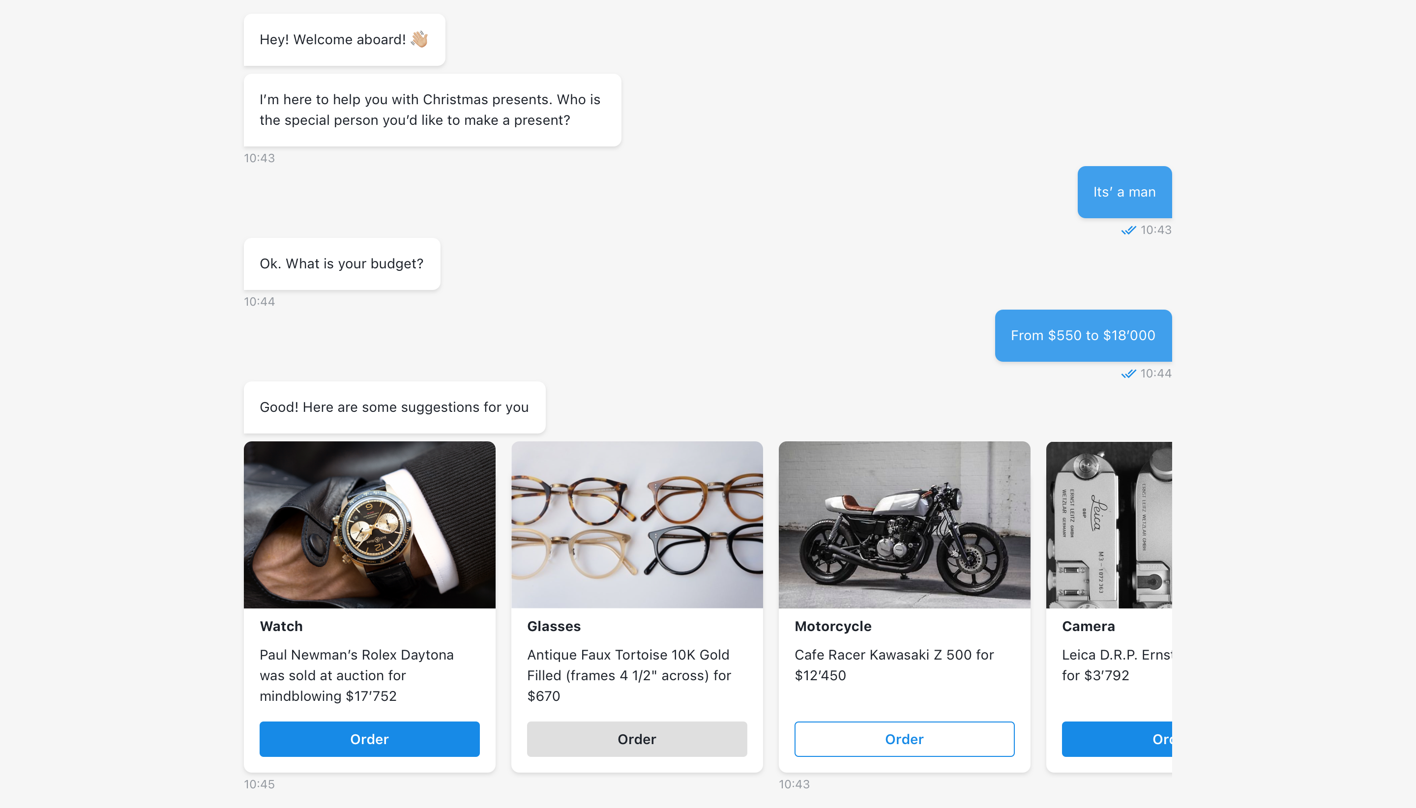
Card is a content container, that incorporates media file like video and / or poster, title and description, submit button and button for additional content.
# Add media to a card
Selected media file will be placed to the top of the card. Both media files (video and image) can be added for a card, or only one media, or none.
Video file can be selected from Files storage or added via URL (HMLT5, YouTube, Vimeo players are supported). No limitation for video duration is set.
Not valid media file will be replaced in a card with a default placeholder.
# Title & description
Title and description are optinal, not limited and have the same properties as the text message input of other components.
# Button label
Button label has 24 chars limit and will be truncated if the limit is exceeded.
# Card ID
The card ID input must be unique for each card.
# Button style
Button style can be changed by selecting one of the styles:
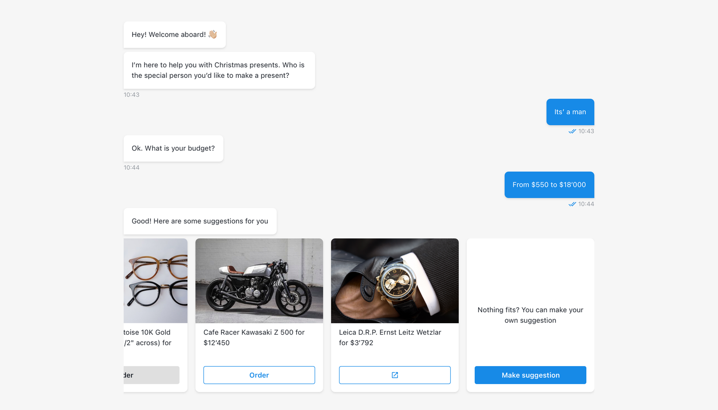
Default- selected by default as suggested by chat design for current component. For card carousel the button will be filled.Outlined(third card on first screen above)Filled(first card on first screen above)Custom(second card on first screen above) - allows to change button style using custom CSS. By default this button appears grey.
# Add modal with additional content
To add an extra information, enable the toggle and add HTML content for each card. Also choose the way, how end-user will interact with additional content: in a modal (by default) or in a child window (the option should be selected separately for each card).
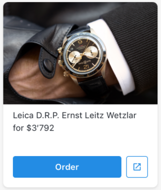
After adding additional content card will have second button right after submit button which open modal with content.
| Card appearance |
|---|
 |
Additional information can be opened in two different ways:
- Default RWC modal window;
- Browser child window.
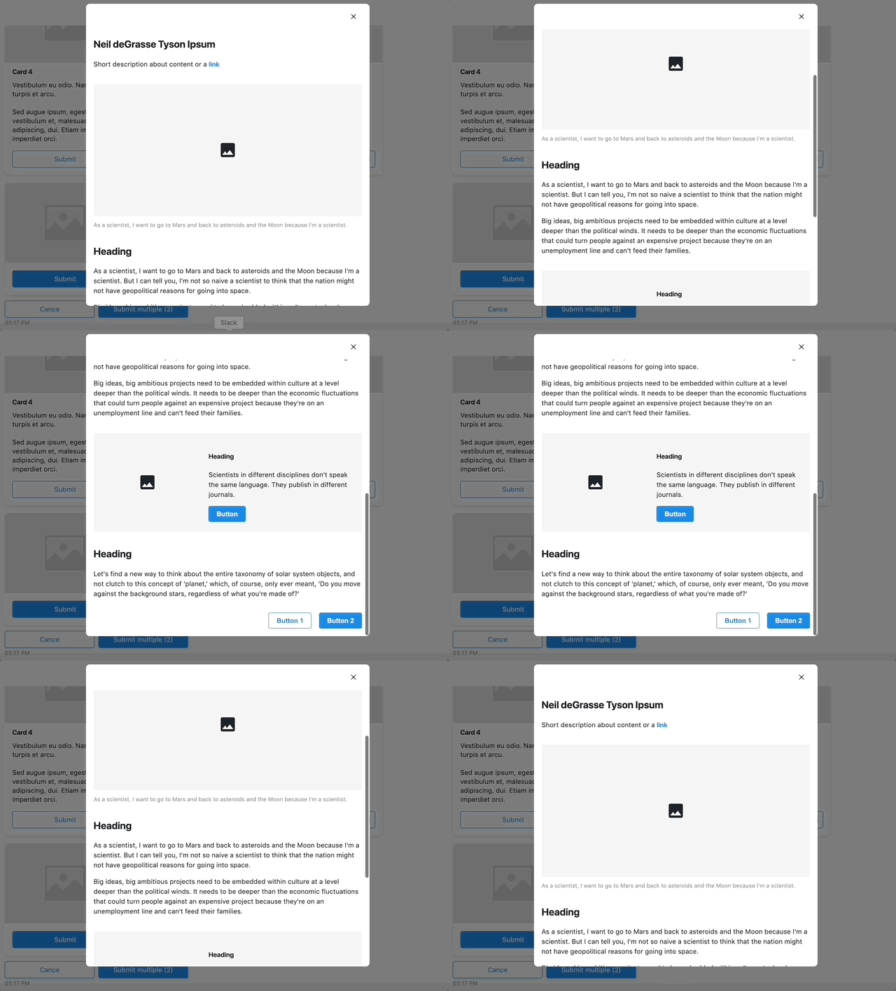
# Additional content HTML example
# HTML
<div class="additonal-info-wrapper">
    <h2>Neil deGrasse Tyson Ipsum</h2>
    <p class="paragraph">
        Short description about content or a <a href="#">link</a>
    </p>
    <div class="picture">
        <div class="image">
            <svg xmlns="http://www.w3.org/2000/svg" viewBox="0 0 24 24" width="40px" height="40px"><path d="M0 0h24v24H0z" fill="none"/><path d="M21 19V5c0-1.1-.9-2-2-2H5c-1.1 0-2 .9-2 2v14c0 1.1.9 2 2 2h14c1.1 0 2-.9 2-2zM8.5 13.5l2.5 3.01L14.5 12l4.5 6H5l3.5-4.5z"/></svg>
            <!-- <img src="your image url"> -->
        </div>
        <div class="label">As a scientist, I want to go to Mars and back to asteroids and the Moon because I'm a scientist.</div>
    </div>
    <h2>Heading</h2>
    <p class="paragraph">
        As a scientist, I want to go to Mars and back to asteroids and the Moon because I'm a scientist. But I can tell you, I'm not so naive a scientist to think that the nation might not have geopolitical reasons for going into space.
    </p>
    <p class="paragraph">
        Big ideas, big ambitious projects need to be embedded within culture at a level deeper than the political winds. It needs to be deeper than the economic fluctuations that could turn people against an expensive project because they're on an unemployment line and can't feed their families.
    </p>
    <div class="product-info">
        <div class="image">
            <svg xmlns="http://www.w3.org/2000/svg" viewBox="0 0 24 24" width="40px" height="40px"><path d="M0 0h24v24H0z" fill="none"/><path d="M21 19V5c0-1.1-.9-2-2-2H5c-1.1 0-2 .9-2 2v14c0 1.1.9 2 2 2h14c1.1 0 2-.9 2-2zM8.5 13.5l2.5 3.01L14.5 12l4.5 6H5l3.5-4.5z"/></svg>
            <!-- <img src="your image url"> -->
        </div>
        <div class="info">
            <h4>Heading</h4>
            <p class="paragraph">
                Scientists in different disciplines don't speak the same language. They publish in different journals.
            </p>
            <a href="#"></a><button class="info-button">Button</button></a>
        </div>
    </div>
    <h2>Heading</h2>
    <p class="paragraph">
        Let's find a new way to think about the entire taxonomy of solar system objects, and not clutch to this concept of 'planet,' which, of course, only ever meant, 'Do you move against the background stars, regardless of what you're made of?'
    </p>
    <div class="info-footer">
        <a href="https://google.com"><button class="info-button outlined">Button 1</button></a>
        <a href="#"><button class="info-button">Button 2</button></a>
    </div>
</div>
<style>
    .additonal-info-wrapper a {
        text-decoration: none;
        font-weight: bold;
        color: rgb(23, 138, 231);
    }
    .additonal-info-wrapper .picture {
        margin: 2rem 0;
    }
    .additonal-info-wrapper .picture .image {
        width: 100%;
        height: 280px;
        background: var(--bodyBackground);
        color: var(--textColor);
        display: flex;
        align-items: center;
        justify-content: center;
        overflow: hidden;
        object-fit: cover;
    }
    .additonal-info-wrapper .picture .image svg,
    .additonal-info-wrapper .product-info .image {
        fill: var(--textColor);
    }
    .additonal-info-wrapper .picture .label {
        margin-top: 10px;
        color: rgb(145, 150, 157);
        font-size: 12px;
        font-weight: normal;
        letter-spacing: 0px;
        line-height: 18px;
    }
    .additonal-info-wrapper .paragraph {
        color: var(--textColor);
        font-size: 14px;
        font-weight: normal;
        line-height: 21px;
    }
    .additonal-info-wrapper .info-footer {
        width: 100%;
        display: flex;
        justify-content: flex-end;
        padding-top: 1rem;
    }
    .additonal-info-wrapper .info-footer a {
        margin-right: 1rem;
        display: block;
    }
    .additonal-info-wrapper .info-footer a:last-child {
        margin-right: 0;
    }
    .additonal-info-wrapper .info-button {
        background: rgb(23, 138, 231);
        border-radius: 4px;
        border: 1px solid rgb(23, 138, 231);
        color: rgb(255, 255, 255);
        font-size: 14px;
        font-weight: 600;
        text-align: center;
        padding: .5rem 1rem;
        outline: none;
        cursor: pointer;
    }
    .additonal-info-wrapper .info-button.outlined {
        background: none;
        border: 1px solid rgb(23, 138, 231);
        color: rgb(23, 138, 231);
    }
    .additonal-info-wrapper .product-info {
        display: flex;
        align-items: center;
        background: var(--bodyBackground);
        align-items: center;
        margin: 2rem 0;
        width: 100%;
    }
    .additonal-info-wrapper .product-info .image {
        background: var(--bodyBackground);
        color: var(--textColor);
        width: 40%;
        height: 210px;
        display: flex;
        align-items: center;
        justify-content: center;
        overflow: hidden;
        object-fit: cover;
    }
    .additonal-info-wrapper .product-info .info {
        width: 60%;
        padding: 0 1rem;
        color: var(--textColor);
    }
    .additonal-info-wrapper .product-info .info h4 {
        color: var(--textColor);
    }
    .rwc-embed .additonal-info-wrapper .paragraph {
        font-size: 16px;
    }
    .rwc-embed .additonal-info-wrapper .picture .label {
        font-size: 14px
    }
    .rwc-embed .additonal-info-wrapper .info-footer {
        justify-content: space-between;
    }
    .rwc-embed .additonal-info-wrapper .info-button {
        font-size: 16px;
        width: 100%;
        padding: 1rem;
    }
    .rwc-embed .additonal-info-wrapper .product-info {
        display: flex;
        flex-direction: column;
    }
    .rwc-embed .additonal-info-wrapper .product-info .image {
        width: 100%;
        height: 220px;
    }
    .rwc-embed .additonal-info-wrapper .product-info .info {
        box-sizing: border-box;
        width: 100%;
        padding: 16px;
        width: auto;
    }
    .rwc-embed .additonal-info-wrapper .product-info .info h4 {
        font-size: 16px;
    }
    .rwc-embed .additonal-info-wrapper .info-footer a {
        width: 100%;
    }
    @media only screen and (max-width: 768px) {
        .additonal-info-wrapper .paragraph {
            font-size: 16px;
        }
        .additonal-info-wrapper .picture .label {
            font-size: 14px
        }
        .additonal-info-wrapper .info-footer {
            justify-content: space-between;
        }
        .additonal-info-wrapper .info-button {
            font-size: 16px;
            width: 100%;
            padding: 1rem;
        }
        .additonal-info-wrapper .product-info {
            display: flex;
            flex-direction: column;
        }
        .additonal-info-wrapper .product-info .image {
            width: 100%;
            height: 220px;
        }
        .additonal-info-wrapper .product-info .info {
            width: 100%;
            padding: 16px;
            width: auto;
        }
        .additonal-info-wrapper .product-info .info h4 {
            font-size: 16px;
        }
        .additonal-info-wrapper .info-footer a {
            width: 100%;
        }
    }
</style>
# Result
TIP
You can use RWC css variables to support both light & dark theme. You can find an example here
# Child window
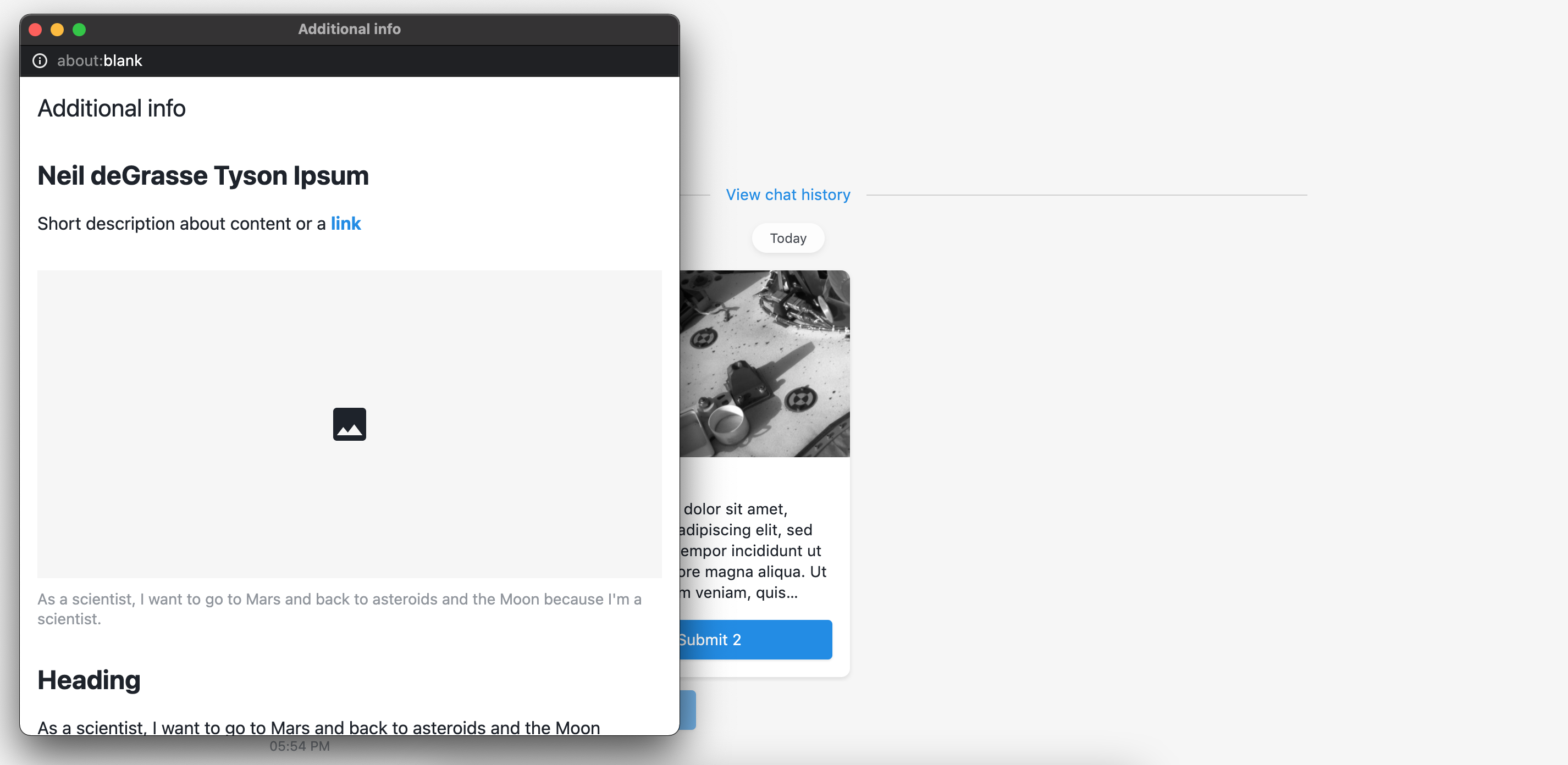
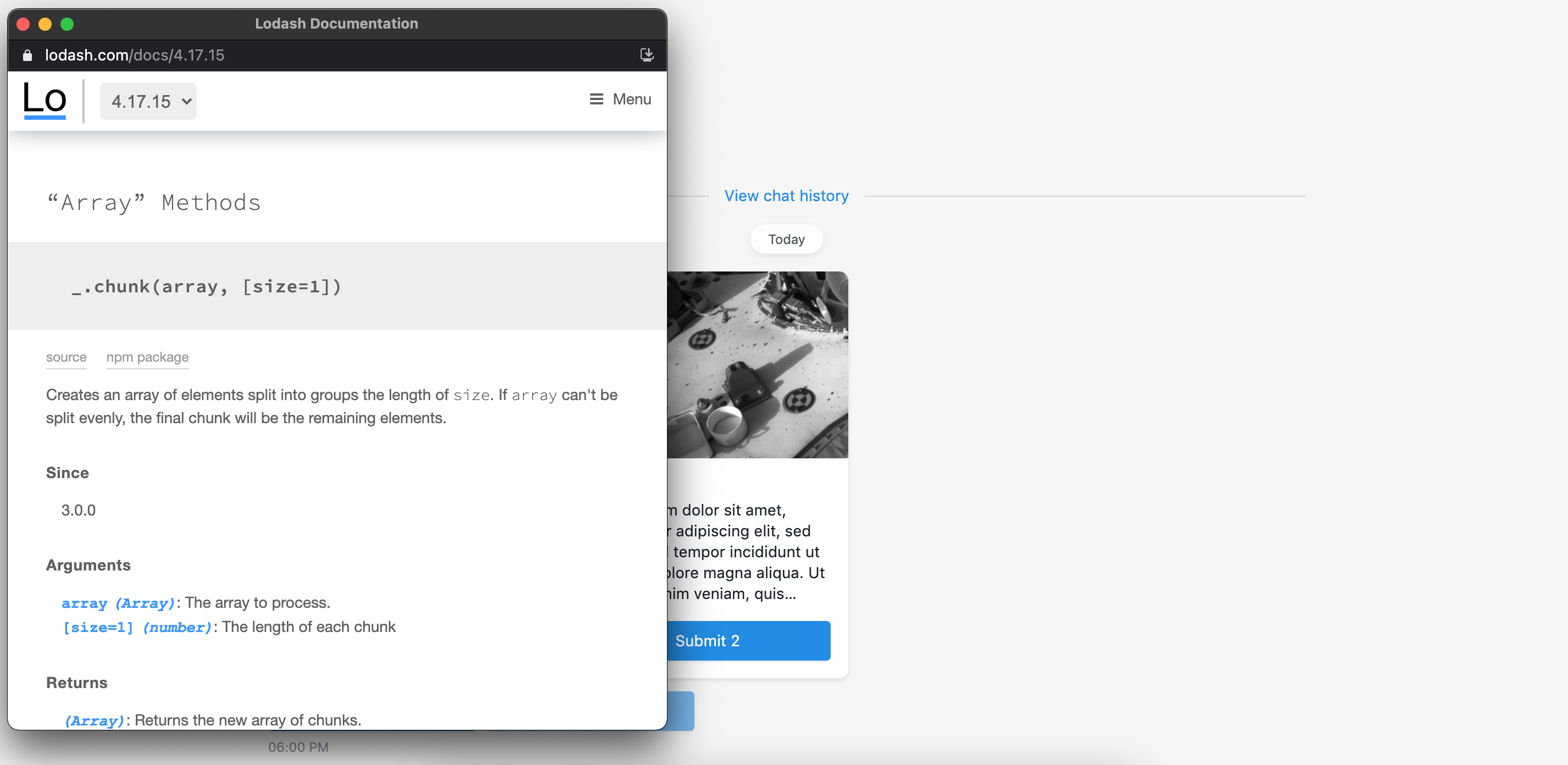
Open content in standard browser child window that almost looks like default RWC modal window. The main difference that this window can be resized and draged. It behaves like browser tab.
# Child window types
Child window can be two types:
- HTML - contain HTML that can be specified on step, just like for default modal;
- File or URL - link to external web-site or file that will be opened in child window.
| HTML |
|---|
 |
| File or URL |
|---|
 |
TIP
Child window with HTML type cannot be opened when chat is running within OneReach.ai apps application or Internet Explorer, instead default RWC modal window will be opened with the same content. Child window with a link to external website or file will be opened as a new tab in browser.
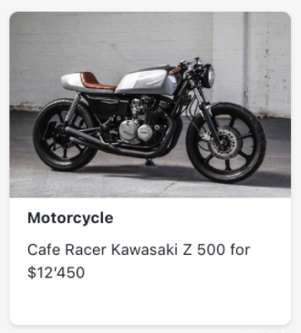
# Show additional content in user answer
If you want to preserve button that opens additional content in user answer, you can switch toggle to true.
| Default reply | Reply with button |
|---|---|
 | 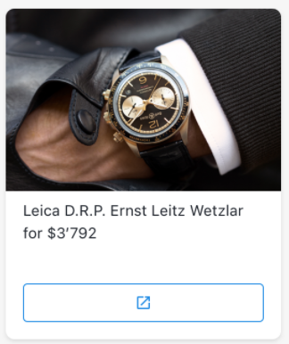 |
TIP
When using chat in OneReach.ai Apps additional content can be opened only in default modal window
# Multiple selection
By default user can submit only 1 card, by turning ON toggle Allow to select multiple cards step will allow end-user to submit multiple cards from carousel.
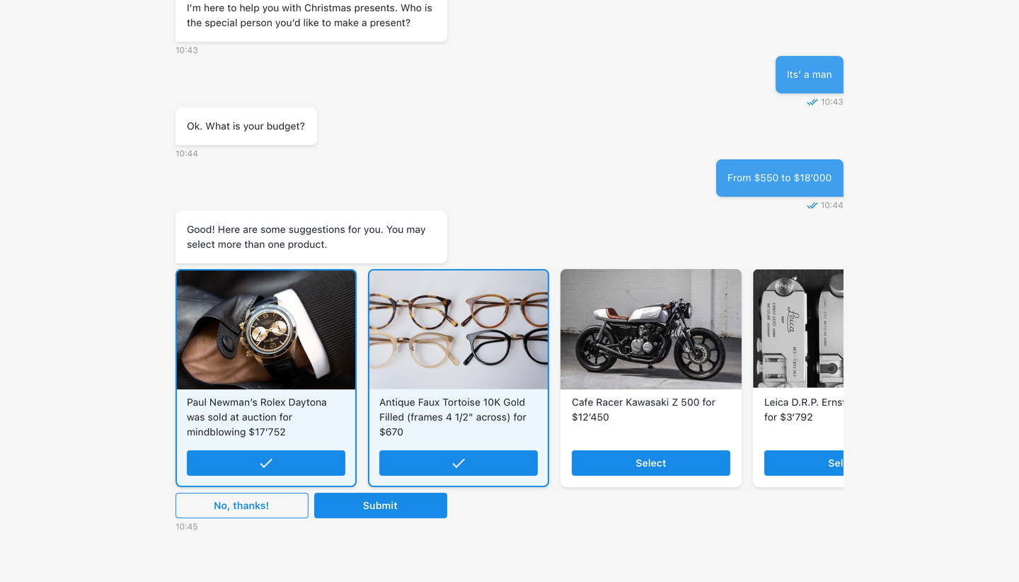
Counter of selected cards will be shown in Submit button.
If user clicks to Cancel button, it's label will be returned in chat thread as end-user's message.
If end-users selects alternative suggestion card, it will be submitted inidiately and card's button label will be returned in chat thread as end-user's message.
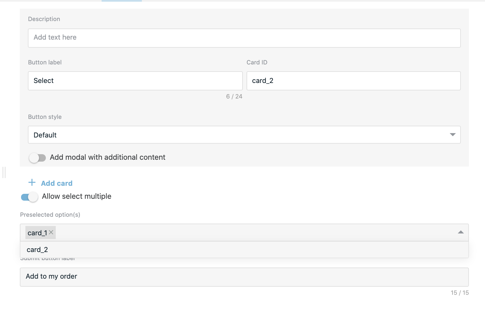
# Preselected option(s)
In step user might select cards (by Card IDs), that will be preselected on client once the component received. End-user will be able to remove it's selection, if preselected card has a button label.
# Submit & Cancel button labels
Buttons allow end-user to submit selected cards or to reject submittal of carousel component.
If submit button label is not set in step, default is: Submit
If cancel button label is not set in step, default is: No, thanks
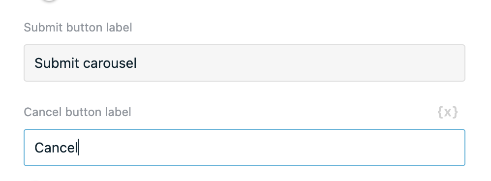
The result will be:

# Add alternative suggestion card
Allows visitor to proceed in chat if any option from the carousel doesn't suit. The option is OFF by default. If ON, then in chat it's always displayed as the last one in order.
Texts can be added to the card in description and button label inputs and if they are not filled, predefined data will be shown in chat (description text: “Nothing fits? You can make your own suggestion.”, button text: “Make a suggestion.”).
# Code mode
In global code mode carousel card(s) can be defined as array of objects (alternative suggestion card might be defined separately):
# Example
[
  {
    image: {
      location: 'https://files.staging.api.onereach.ai/public/207599ef-0029-4f8a-9595-3afd71d15392/image.jpg', // card image
    },
    video: {
      location: 'https://files.staging.api.onereach.ai/public/207599ef-0029-4f8a-9595-3afd71d15392/video.mov',  // card video
    },
    title: 'This is a card title', // <String> card title
    description: 'This is a card description', // <String> card description
    buttonLabel: 'Select', // <String> card submit button label
    value: 'card_1', // <String> card submit value
    hasModal: true, // <Boolean> if card has modal with additional content
    modalType: 'default-modal', // <String> additional modal type 'default-modal', 'child-window'
    childWindowType: 'html', // <String> if modal type is 'child-window' it can be 2 types: 'html' and 'url'
    additionalContentLink: {
      location: 'https://google.com', // <String> card additional content URL
    },
    buttonStyle: "default", // <String> card submit button style
    html: "<body> Some text is here</body>", // <String> card default modal additional content HTML
    showModalButtonInUserResponse: true, // <Boolean> whether preserve additional content button in user response or not
  }
]
TIP
Media sources can also be defined using this structure, which is valid too:
{
  image: {
    linkUrl: 'https://doc.qt.io/archives/4.3/images/groupbox-example.png',
  },
  video: {
    linkUrl: 'https://vimeo.com/296089891',
  },
  additionalContentLink: {
    linkUrl: 'https://google.com',
  }
}
# Alternative card code mode example
{
  description: '',  // <String> card description
  buttonLabel: '',  // <String> submit button label
  buttonStyle: '',  // <String> submit button style
  value: ''         // <String> card submit value
}
# Output
The output of the step will include the chosen by the user card with its:
- Card ID
- Card image
- Card video
- Card title
- Card description
- Card submit button label
- Card additional content link
All values will be trimmed. If value is empty or not specified it will be undefined.
TIP
Both single and multiple selection will result to array of one or multiple cards.
# Structure for Request Response (RWC) v4.2.82 and higher versions of the step:
{
  cards: [
    {
      cardId: '',                 // <String> card ID, if specified
      image: '',                  // <String> link to card image, if specified
      video: '',                  // <String> link to card video, if specified
      title: '',                  // <String> card title, if specified
      description: '',            // <String> card description, if specified
      buttonLabel: '',            // <String> card submit button label, if specified
      additionalContentLink: '',  // <String> link to additional content, if specified
    }
  ]
}
# Structure for Request Response (RWC) v4.2.81 and lower versions of the step:
{
  card: {
    cardId: '',       // <String> card ID, if specified
    title: '',        // <String> card title, if specified
    label: '',        // <String> card title, if specified
    description: '',  // <String> card description, if specified
  }
}
TIP
Since Request Response (RWC) v4.2.82 component allows to submit multiple cards for backwards compatability carousel output supports old structure, but only when option Multiple selection is OFF.
# Structure of the alternative suggestion card
When submitting alternative suggestion card structure of the output will be slightly different.
Note that alternative suggestion card does not have any medias (image or video) or additional contents. It's main purpose to indicate that current card options does not fully suit user request.
{
  cards: [
    {
      description: '',  // <String> card description, if specified
      buttonLabel: '',  // <String> card submit button label, if specified
      buttonStyle: '',  // <String> card submit button style
      value: '',        // <String> card ID, if specified
    }
  ]
}
# Structure of Cancel response
When allowing to submit multiple cards user can also reject selecting any of the cards by clicking on No, thanks button. In this case output will be an empty array.
{
  cards: []
}
# Use function to define user answer
Allows to override default answer by custom message.
# Available variables
{
  cards: [
    {
      cardId: '',                 // <String> card ID, if specified
      image: '',                  // <String> link to card image, if specified
      video: '',                  // <String> link to card video, if specified
      title: '',                  // <String> card title, if specified
      description: '',            // <String> card description, if specified
      buttonLabel: '',            // <String> card submit button label, if specified
      additionalContentLink: '',  // <String> link to additional content, if specified
    }
  ]
}
TIP
For backwards compatability purposes old structure is supported, but only when option Multiple selection is turned off.
{
  card: {
    cardId: '',                 // <String> card ID, if specified
    image: '',                  // <String> link to card image, if specified
    video: '',                  // <String> link to card video, if specified
    title: '',                  // <String> card title, if specified
    description: '',            // <String> card description, if specified
    buttonLabel: '',            // <String> card submit button label, if specified
    additionalContentLink: '',  // <String> link to additional content, if specified
  }
}
# Example
const titles = cards.map(card => card.title);
return titles.join(', ')
# Step configuration:
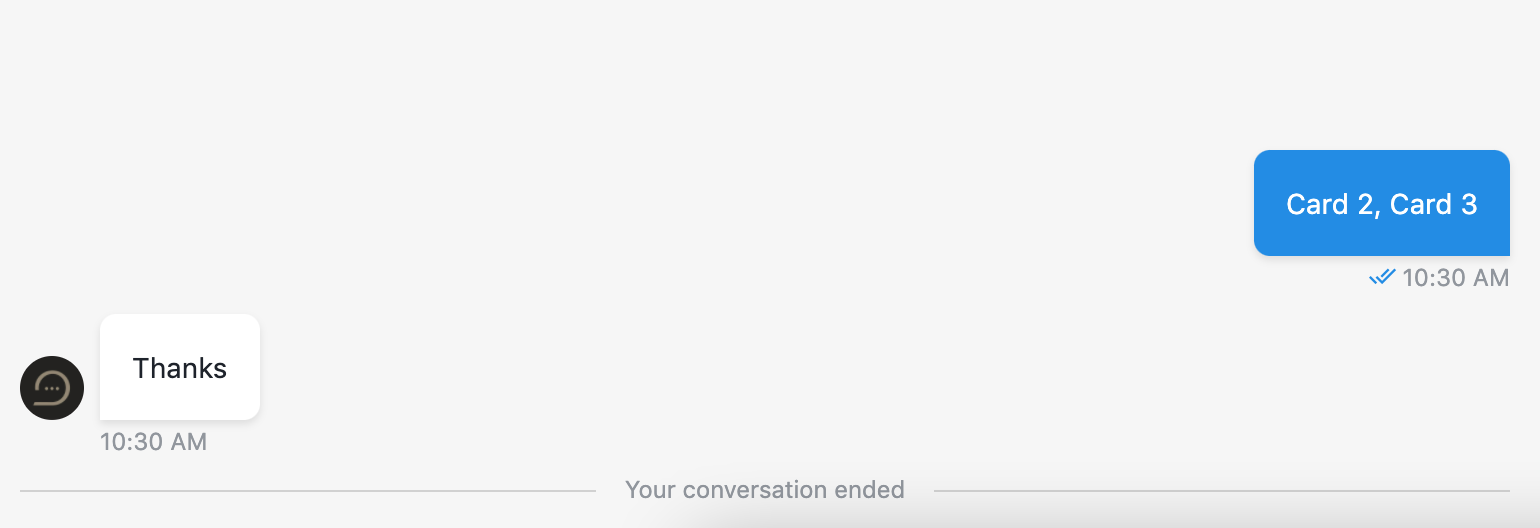
There are three cards with titles: Card 1, Card 2, Card 3 and Multiple selection option is on.
 After submit, create array with card titles:
 ['Card 2', 'Card 3'] and then join them to build user answer (see user reply in result image).
# Result:
